
BritBox is an online digital video streaming subscription service, founded by BBC Studios and ITV, operating in nine countries across North America, Europe, Australia and South Africa.
The service offers a vast library of British television content, including dramas, comedies, documentaries, and more. BritBox's mission is to celebrate the best of British entertainment and provide a unique viewing experience for its subscribers.
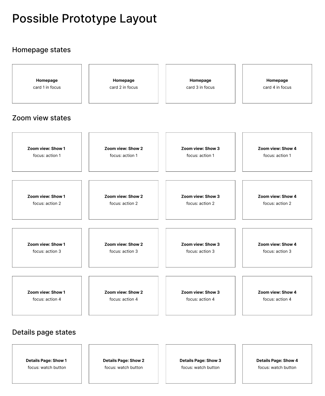
As the UX Design Intern, my responsibilities included conducting an exploratory case study investigating UI changes to the cross platform TV app. I went through the entire design process, creating user profiles, wireframes, mockups, and interactive prototypes to visualize potential enhancements. This experience was the highlight of my summer, allowing me to grow as a person and designer while working under industry-level entertainment product management.
The BritBox research team recently conducted a study where they did group interviews with BritBox customers to learn more about the role of BritBox in their customers’ lives.
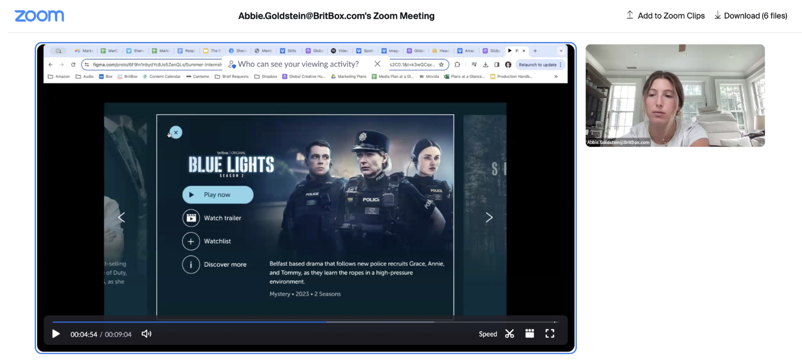
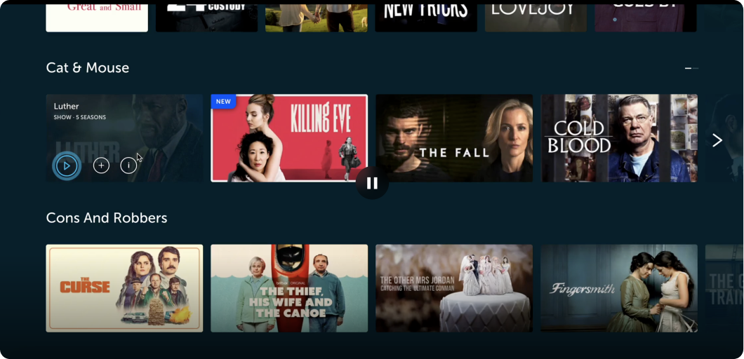
One observation from these interviews was that people want to know more about the shows when browsing the UI for something to watch. The current UI, like most streaming services, has a wall of poster rails on the home page. So each show or movie is represented by a single image, and to learn more about it, you need to click to go to the details page, where you can see metadata and the episodes list.
After reviewing the user flow myself, I concluded:
To begin, I investigated the different types of users that are typically subscribed/using BritBox. I always like to create fictitious personas so that I can jump into the users' shoes and really understand the needs, wants, thoughts, and priorities of the target user. I found four overall categories:
Based on these user categories, I created content discovery scenarios of a typical BritBox subscriber. I worked with the Editorial Team by identifying the pain points associated with each scenario and brainstorming potential solutions. We discussed what content should be highlighted, and more specifically, that show descriptions should be emphasized on the site.
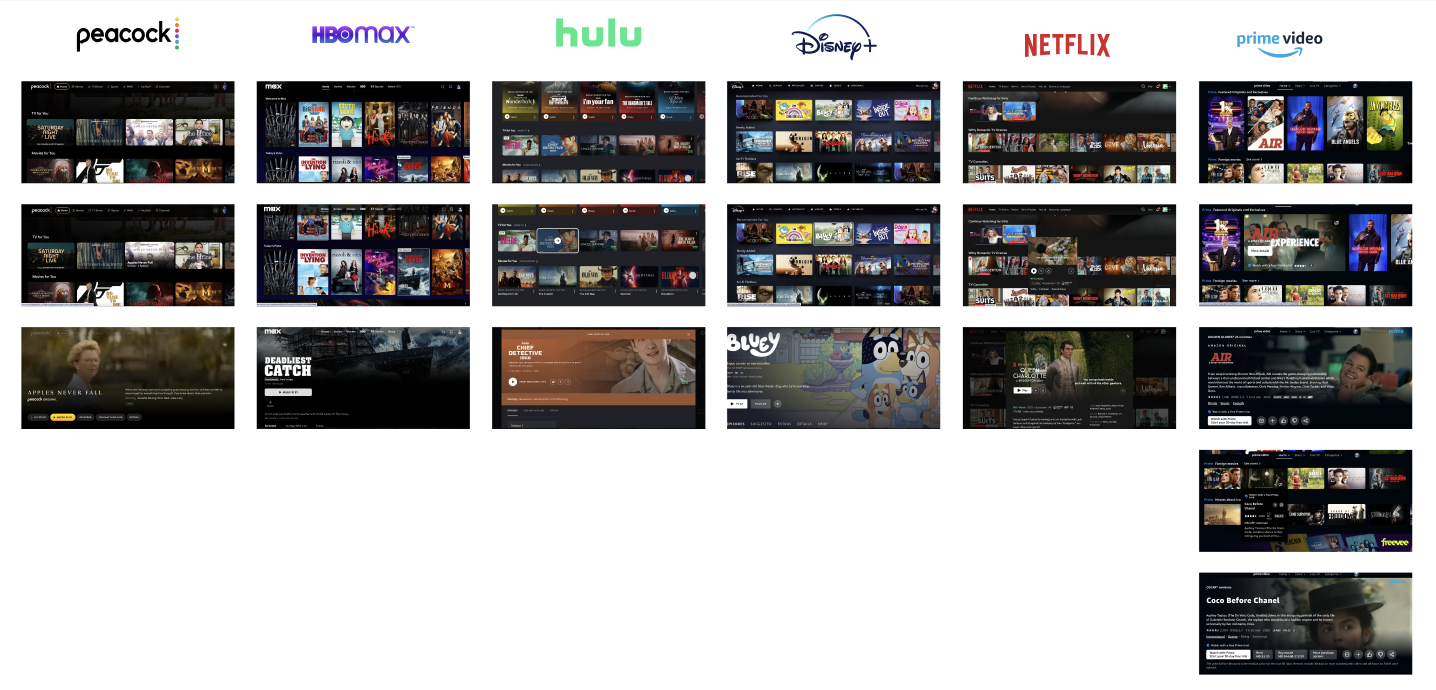
I then conducted a comparative analysis of BritBox and other leading streaming services.
After reviewing the user flow myself, I concluded:
I started brainstorming different features that could solve the inefficiency and restriction problem within the app to create an elevated user experience.
I came up with 5 different potential solutions that would expand the user journey between the Home Page and Details Page…
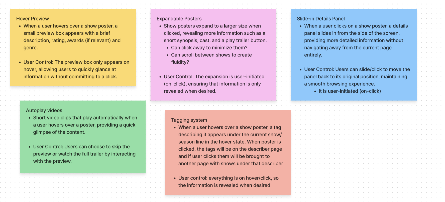
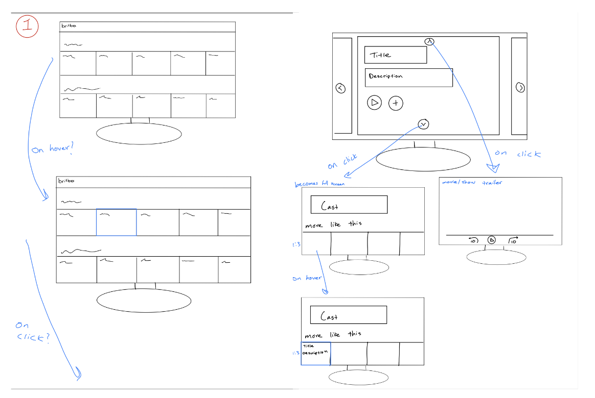
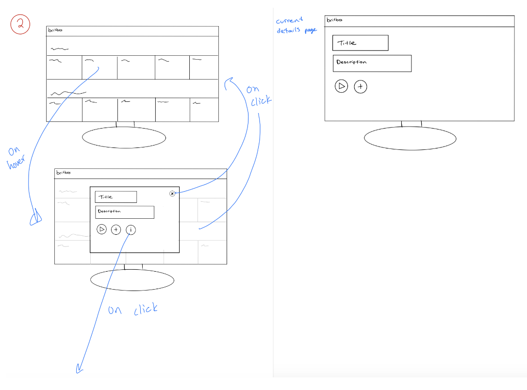
I decided to sketch the Expandable Posters, Hover Preview, and Tagging System features.
I found that the pain points for the Autoplay videos feature would be extreme with BritBox’s older audience.
I also found the slide-in details feature to be difficult on a TV app, and may be better suited on a different media platform.
Feature 1:
Feature 2:
Feature 3:
After weighing the pros & cons of each feature, I decided to proceed with a version of the Expandable Posters feature. I thought it was the most effective way to create a flexible and efficient user-driven experience while also providing users with necessary content.
I began exploring the user flow with the feature by creating iterations of the Home Page, Pop-Up State, and Details Page. I started to experiment with the placement/type of buttons. I decided to stack the buttons vertically so that a user with a remote could easily scroll through the rail – if they were horizontal it would be quite annoying to click through them all.
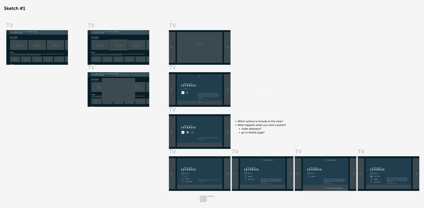
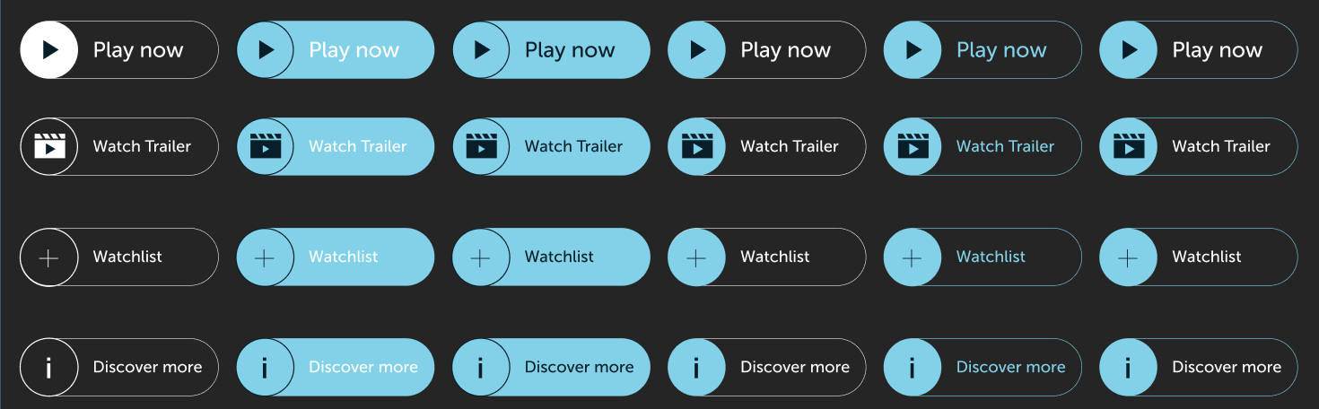
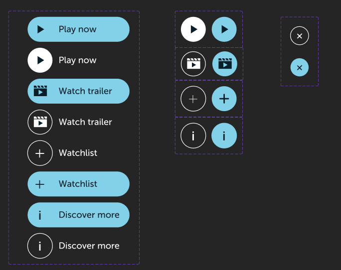
I experimented with the UI design of the buttons that would appear on the pop-up state. I wanted a final design that was intuitive and clear to users. I tried to put myself in the shoes of the user.
Sometimes TV users can get distracted and walk away from the screen to complete a task. I wanted my design to be easily understood so that if a user came back, or if a new user entered, they would know exactly where they had left off.
I decided to proceed with this final UI toolkit – they were clear for an older audience while maintaining the BritBox brand. I also found them to be organized and intuitive for someone navigating the app.

I experimented with what I wanted to be highlighted when entering the focus state. I didn’t want the buttons to be distracting but rather simple and useful for subscribers to easily find their show of interest and access the relevant content.
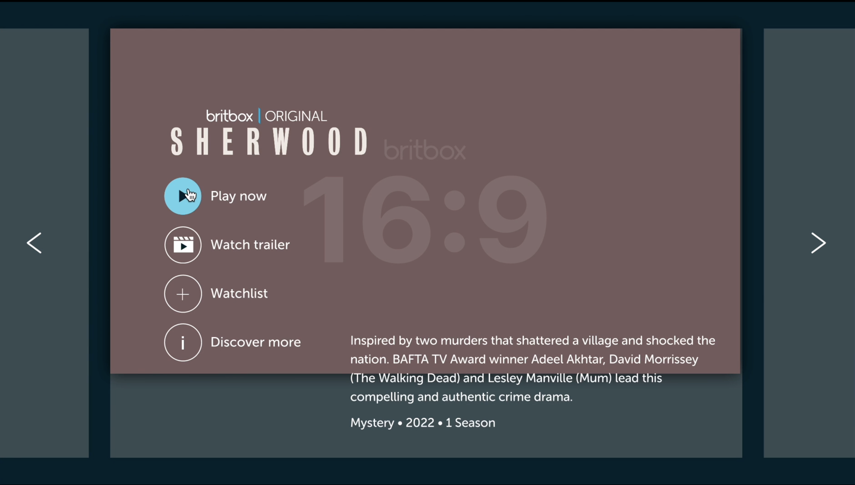
After consulting with the head of the UX team, I decided to proceed with Iteration #1.
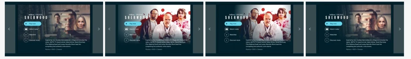
I began to experiment with the show poster’s gradient to ensure that all of the words were clear and readable. I used show artwork that was bright, as well as dark, to figure out an overlay that would suit all ranges of colors. I ensured the text was readable for people that were colorblind, or had vision impairments.
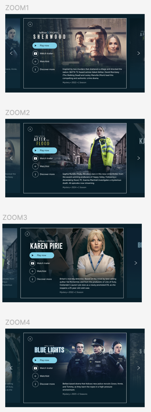
I drafted a layout of my prototype and began creating the high-fidelity screens that would be used for it. I selected 4 shows in the “Killer Mystery” rail on the BritBox app, chosen by the editorial team, for my prototype.
After creating a mock-up of my feature, I created a test plan to get feedback and see how it functioned with real users. BritBox employees volunteered and I conducted a series of tasks for them to complete. By evaluating their frustrations, comments, emotions, and ability to complete the tasks, I could see the functionality of my feature and evaluate its potential implementation onto the live app.