
Company Context:
DriveWealth is a global fintech company that offers Brokerage-as-a-Service – essentially, they provide the technology, brokerage infrastructure, and APIs that let other companies embed investing directly into their products. Their partners include banks, broker-dealers, fintech apps, and consumer brands around the world, and the platform supports trading in U.S. equities, ETFs, mutual funds, fixed income, and options. They pioneered fractional share investing, and today their technology powers everything from instant account opening and funding to seamless trade execution – all while meeting regulatory requirements. In short: they make it possible for people anywhere to invest from their phone, and they give partners the tools to launch that experience quickly and at scale.
My Role:
During my Product Design internship, my primary focus was DriveHub, the client portal dashboard used by partners and internal teams. I led the design of two major enhancements: a search feature that made it easier to quickly filter and locate accounts, and multi-asset class integrations that expanded the dashboard’s capabilities beyond equities to include other asset types. In parallel, I worked with the Growth team to redesign the Solutions pages of the website, creating a more compelling and conversion-focused partner experience. I also collaborated with an external company to design customizable sales demo mock-ups that could be run side-by-side with live API code, giving prospective partners an interactive way to explore DriveWealth’s technology in action.
Contact me at abbiegoldstein19@gmail.com if you’d like to learn more or see a demo of my internal work.
One of my main projects was improving the search function within the Client Portal. After speaking with operations team members and product owners, I learned that search was the most critical part of the dashboard. It was the primary way teams located accounts, users, and orders in order to complete time-sensitive operational tasks, making its efficiency essential to daily workflows.
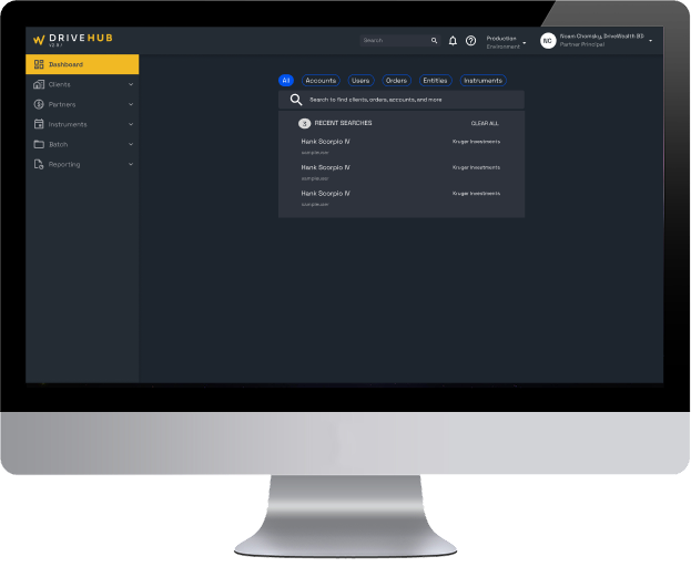

The search bar was visually small and placed in the corner of the interface, making it easy to miss and difficult to discover.
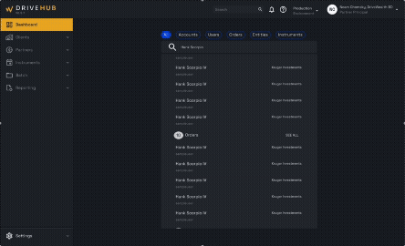
Users often had to manually scroll through long tables to find information, increasing time spent on basic tasks.
Based on the pain points uncovered, I defined the following goals to guide the redesign:
To make search more efficient and predictable, I redesigned the experience around clear, category-based filters that guide users before they ever begin typing.
Instead of a single, ambiguous search field, the new design introduces clearly labeled filter pills for Accounts, Users, Orders, Entities, and Instruments. These filters allow users to define what type of data they are searching for up front, reducing ambiguity and increasing result accuracy.
To support real-world workflows where users often need to reference multiple data types at once, I designed the filters to be multi-selectable, allowing users to search across categories simultaneously. This gave operations teams more flexibility and reduced the need to run multiple separate searches.
The search bar was repositioned into a central, high-visibility container and paired with supporting guidance to reinforce its role as the primary action of the dashboard.
To further support efficiency, I added a Recent Searches panel that surfaces commonly accessed records, allowing operations teams to return to active accounts or orders with a single click. This reduced repeated searching and improved task speed for high-frequency workflows. Together, these changes transformed search from a hidden, inconsistent utility into a prominent, structured system that scales with additional workflows and data types.
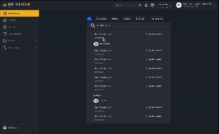
I also explored how search could be more fully utilized across the dashboard by introducing expandable result views. I designed two different interaction models to test with members of the operations team: one where the results panel expanded and shifted the dashboard content horizontally, and another where the panel expanded vertically within the existing layout. I tested both approaches to understand which felt more intuitive and comfortable for daily workflows.
I worked on redesigning the order page framework to support multiple asset classes within a unified, modular structure. I partnered with product and engineering to identify which data fields were shared across asset types and which needed to be dynamic. From there, I designed flexible component patterns that could adapt based on asset type while maintaining consistent hierarchy and interaction behavior.
This approach allowed new asset classes to be integrated without redesigning the entire page each time, improving scalability and reducing future development overhead while preserving clarity for operations teams managing diverse financial products.
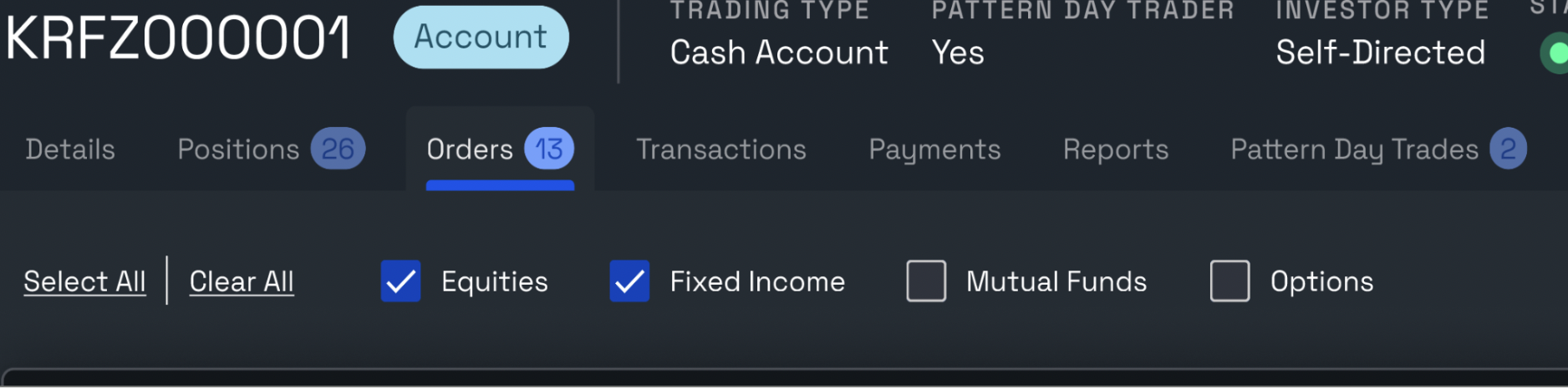
To understand how operations teams worked across different asset classes, I met with product owners and stakeholders to walk through real order-management workflows. I learned that users frequently needed to view and compare multiple asset classes at once, which made single-select dropdown patterns limiting and inefficient.
Based on this insight, I proposed a checkbox-based selection model that allowed users to view multiple asset classes simultaneously rather than switching between them one at a time. I explored several layout and hierarchy options, iterating through multiple design rounds to ensure the selection controls felt intuitive and did not overwhelm the page. Each iteration was reviewed with product and engineering to balance clarity, usability, and technical feasibility.
This iterative process resulted in a flexible selection model that better matched real operational workflows while remaining scalable for future asset classes.