
SmartPark is a semester-long exploratory project I worked on for my Human-Computer Interaction course, focused on improving the parking experience on Cornell’s campus. Students and faculty often waste time circling garages in search of available spots, leading to unnecessary stress and delays.
SmartPark tackles this issue by combining real-time sensor data with a user-friendly, color-coded digital map that displays live parking availability across campus garages. As one of the UX designers and researchers, I helped lead the end-to-end process—from uncovering user pain points to prototyping and testing a more efficient, intuitive solution.
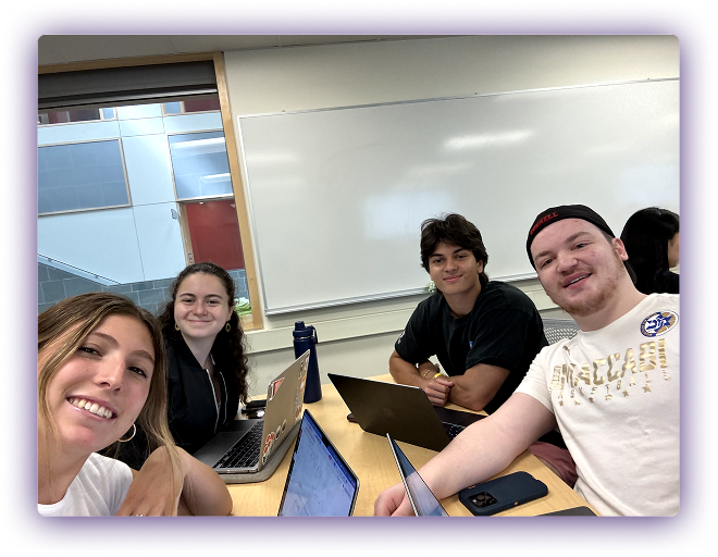
Collaborating closely with three other Cornell students, I strengthened my teamwork skills and gained valuable insight from different design perspectives.
Through early conversations and personal observations, my team and I identified a recurring issue with parking on Cornell’s campus. Despite owning cars, many students said they avoided driving to campus events or classes because the parking situation was unpredictable and frustrating.
Students and faculty often spent 10–20 minutes circling garages, unsure where spots might be open—ultimately arriving late or abandoning the trip altogether.
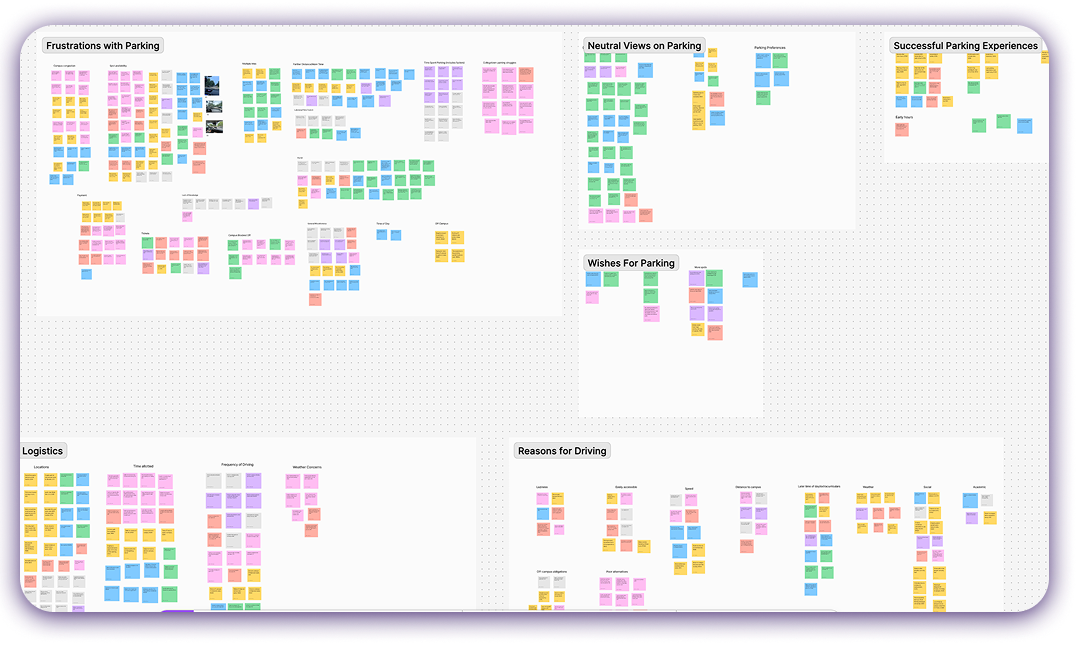
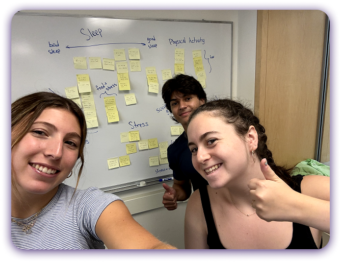
From these 1:1 interviews, we used affinity mapping to synthesize the data. We grouped quotes, behaviors, and observations into themes that highlighted what mattered most to users.
Key Themes That Emerged:
This research revealed that the problem wasn’t just about space, but about clarity and control. By addressing these emotional and logistical friction points, we could create a solution that genuinely supported users’ needs.
Students with cars at Cornell need a way to find more available parking on campus because they want to minimize the hassle, added stress, and time expense of parking while maximizing the convenience of having a car on campus.
Market Research:
To better understand how other institutions and companies were addressing similar parking challenges, I conducted a competitive analysis of existing smart parking solutions. This included university systems, municipal infrastructure, and private apps offering real-time parking data and navigation support.
While some offered mobile interfaces and garage counters, many lacked an intuitive user experience, real-time accuracy, or integration with students’ daily routines. Most solutions also focused on urban environments, which presented different needs compared to a campus like Cornell.
Solution Brainstorm:
I then sketched 10 solutions different than what I found and pitched them to my team. We discussed the pros and cons of each one (combined we had 40 ideas) and came up with an initial solution idea.
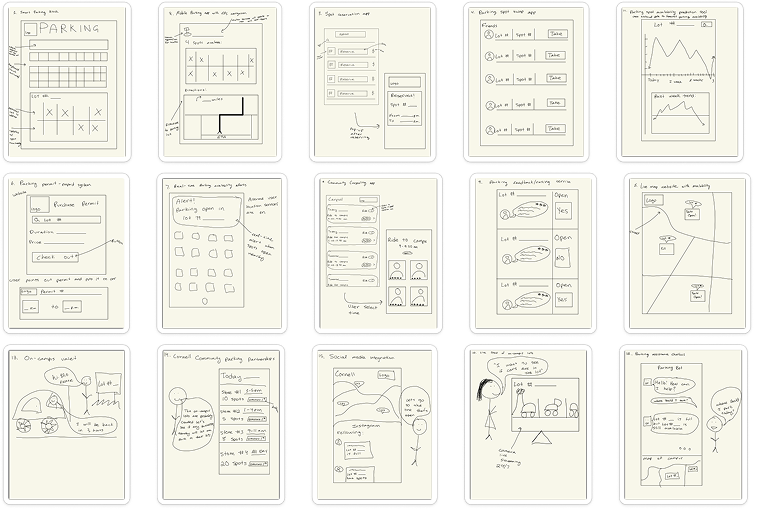
THE SOLUTION: Mobile app integrated with real-time license plate scanners at each parking spot
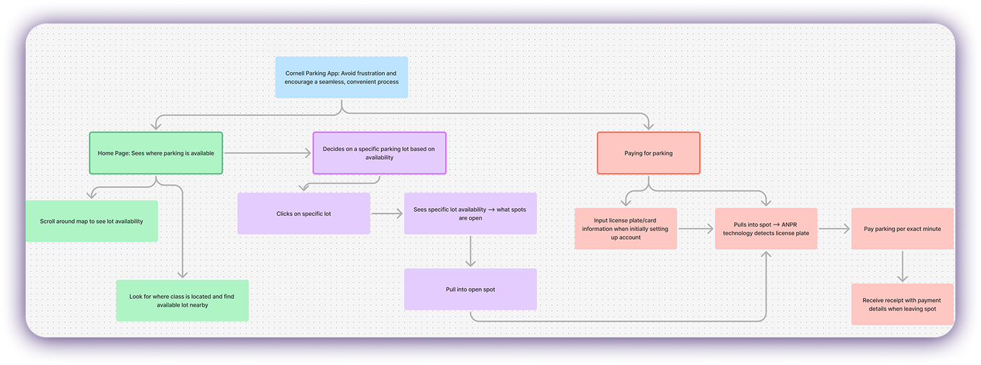
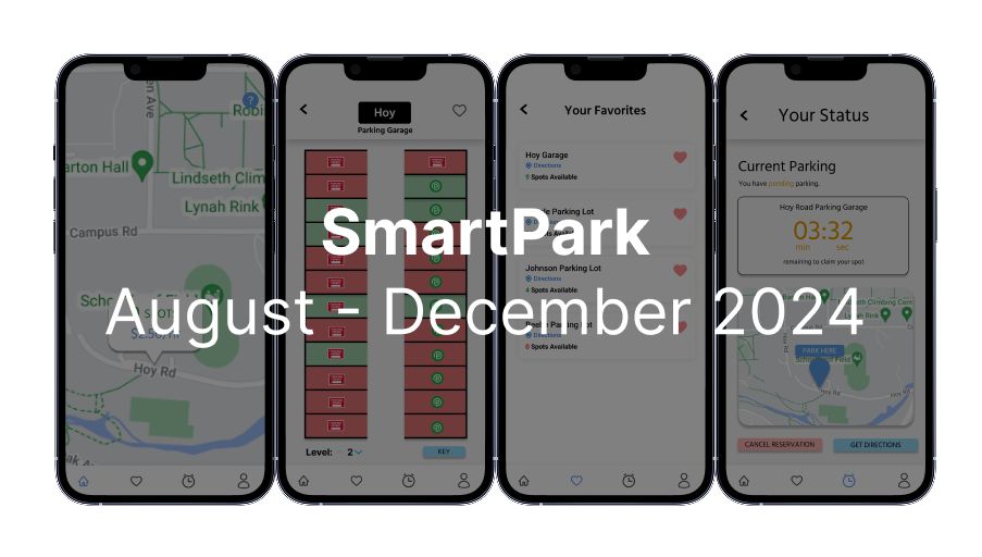
I mapped out a streamlined user flow to reflect how students and faculty navigate parking—from checking availability to paying for a spot. Users begin on a real-time map, scroll to find open garages, and select a lot near their destination. After parking, license plate recognition handles payment automatically, charging by the minute and sending a digital receipt.
This flow emphasizes clarity, convenience, and minimal friction, and it served as the foundation for my wireframes.
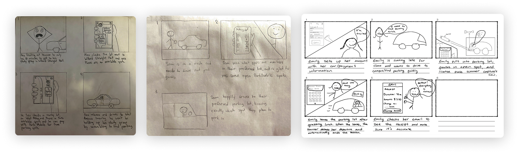
To visualize the user experience and identify emotional highs and lows, our team created storyboards that mapped out key moments in the SmartPark journey—from the stress of circling a full garage to the relief of finding an open spot through the app. This helped us empathize with users and validate that our solution addressed not just functional needs, but emotional ones too.
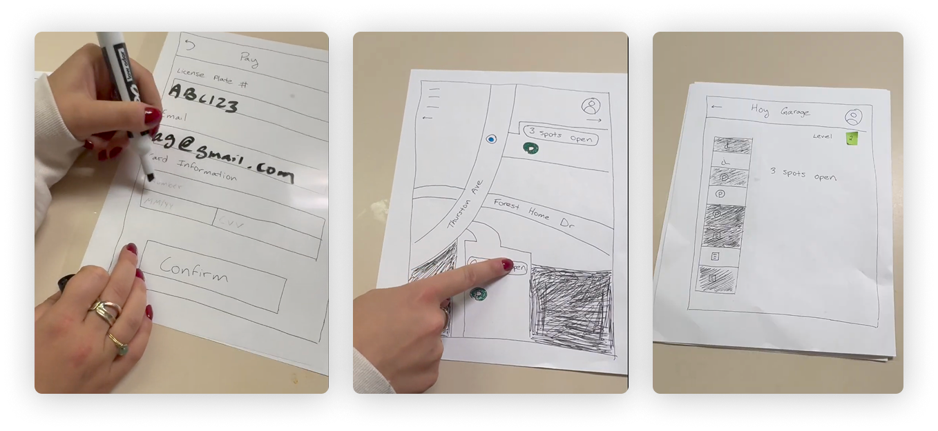
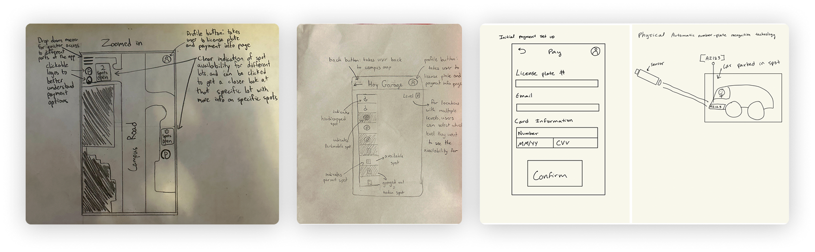
After developing the storyboard, I translated key moments into low-fidelity paper screens and conducted testing using paper prototypes. This approach helped slow down the interaction, allowing users to think aloud as they moved through the experience. It also gave me a clear, large-scale view of each screen and transition, making it easier to visualize the overall flow and identify friction points early on.
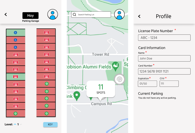
To bring our paper sketches to life, I created medium-fidelity wireframes in Figma based on our tested low-fis. These screens focused on layout, hierarchy, and core interactions. As a team, we reviewed the flow together, identified pain points, and collaborated on areas for improvement—refining visual clarity, simplifying navigation, and aligning the design more closely with user needs.
We decided to add:
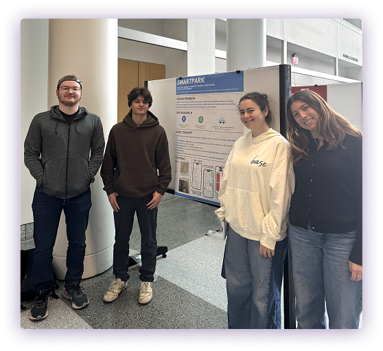
We presented SmartPark at our end-of-semester design symposium, walking attendees through our research, design process, and final solution. It was incredibly rewarding to justify our decisions with real user insights and see our work resonate with others. We received enthusiastic feedback from students—many saying they wished the app existed in real life, which validated the need and impact of our solution.